Little Big Smala: Explainer Animation

Little Big Smala, Red Cat’s partner ordered us to make a short video to explain their service and we were honored to help them out.

Client: Little Big Smala
Agency: Red Cat Motion

Define the direction

As usual, we spent lots of time working on the concept and direction for any animation project. The concept was very fun. It was the first time we heard of the term “Smala”, and it became a big idea. If you haven’t heard of it, the term “Smala” means a group of servants around a chief in an Arabic clan. When any client is working with us, they deserve the same approach to achieve the best result.

Styleframes

We got many rounds to define the right direction. This step might take time, but it is very important.

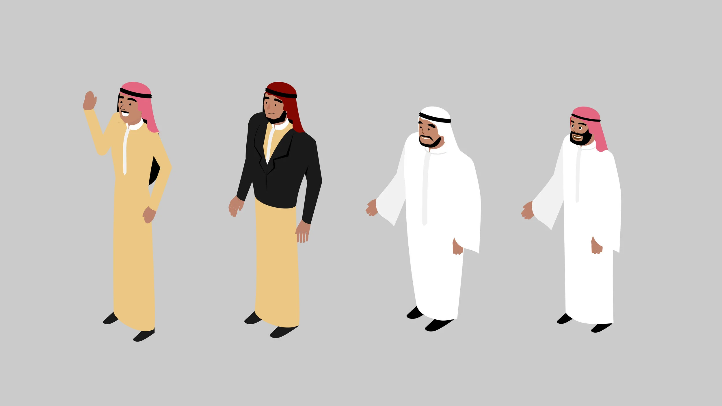
For the gallery, we presented many options for the characters and the design style.

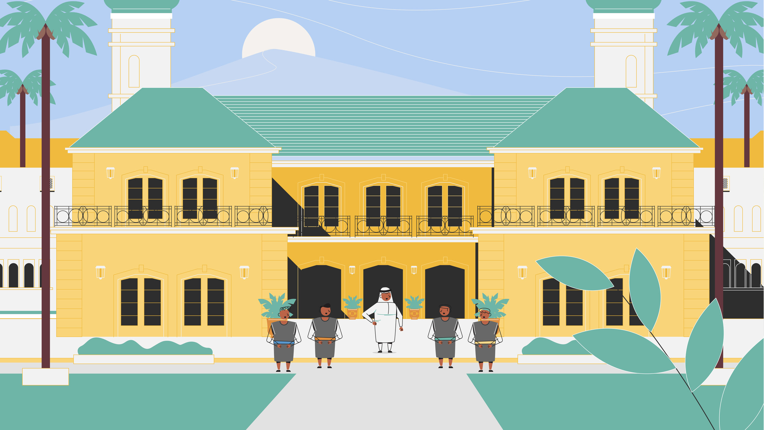
This is the final style that everyone was happy with.

Styleframe_Smala_180525-01.jpg
Styleframe_Smala_180525-02.jpg

Storyboard

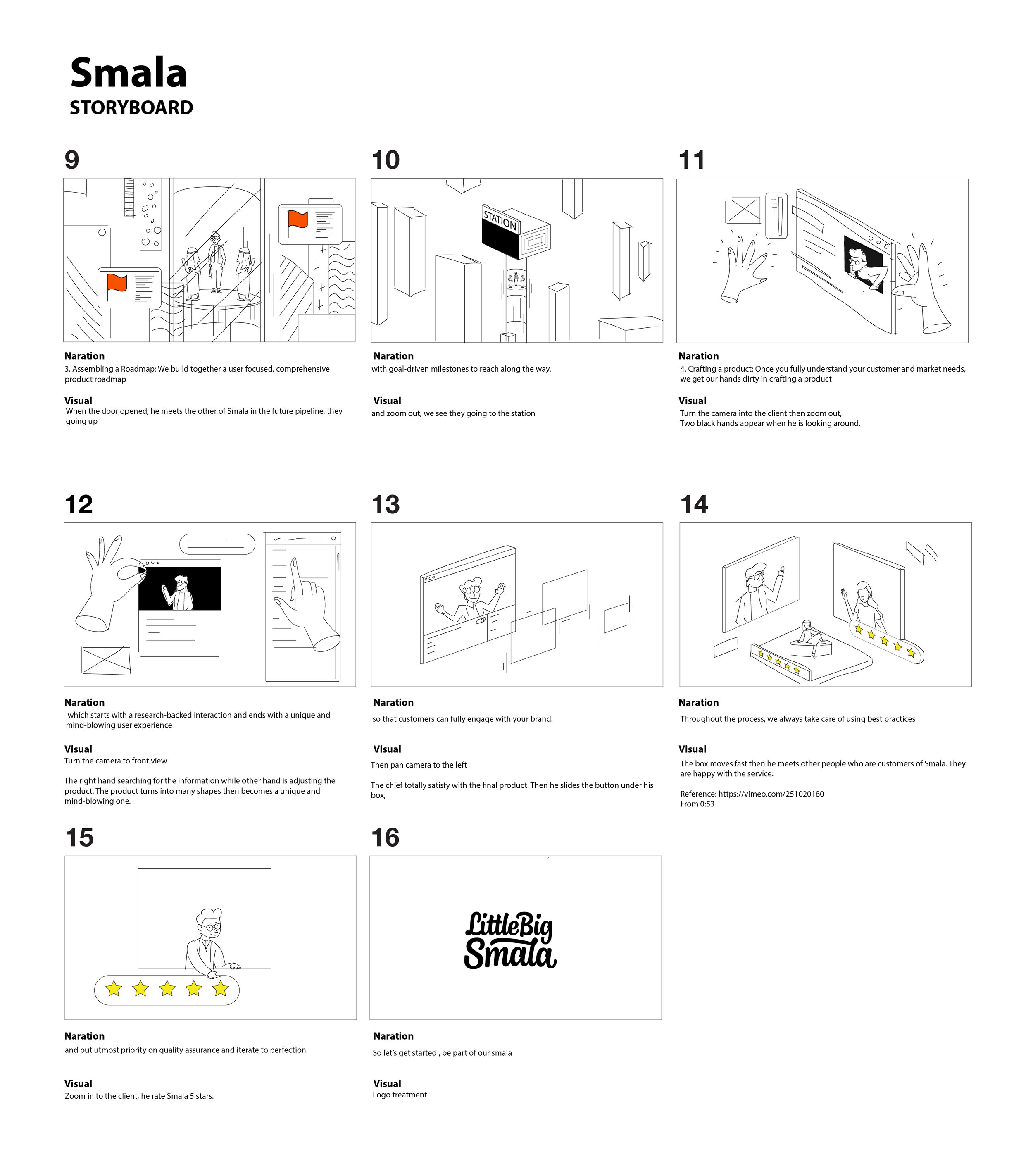
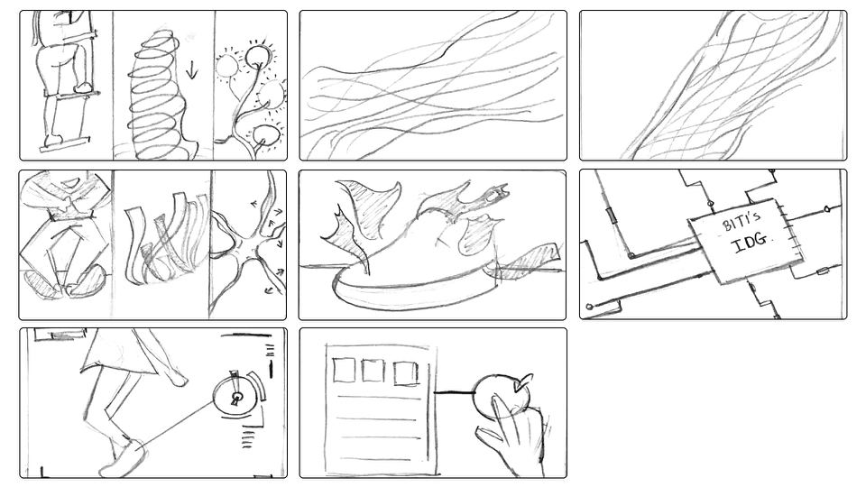
We had fun making visual ideas for this project. A lot of options were considered before we nailed down to this board.

Smala_Storyboard_Sketch_180518-01.jpg
Smala_Storyboard_Sketch_180518-02.jpg

Biti's Smart: Explainer Animation

Have you ever heard about the scientific fact that activities make kids smarter? Biti's Smart is an ambitious project of Biti's to help kids grow smarter through physical exercises. In order to achieve that, Biti's Kid creates a range of shoes with 3 main purposes:

Comfort: Shoes are designed with the latest technologies such as Phylon, EVA and Airmesh to make kids comfortable while wearing. As a result, shoes are softer, lighter and more comfortable.

Smart: Inside every pair of shoes, there are chips designed to track kids’ activities. These chips are connected with Biti's Smart app so parents can review all the physical data and suggest to them the best activities for their children.

Together with IPD, Biti's wants to study and research the activity benchmark for Vietnamese kids.

Our scope of work: Create a story to inspire audiences of the latest Biti's Kid's product. 

Client: Biti's Kid
Agency: Redder, Red Cat Motion
Director: Leo DINH, Hoang Anh
3D Production: Freaky Motion
Live Production: Draco Film
Sound Designer: Luke Brown

 How did we make this?

The project was very inspiring and so challenging. We only got the right outcome until the last minute. From the beginning, this project was strictly confidential because it would become a game-changer. Our Director Leo DINH had to work on the concept alone himself without letting anybody knew.

Storyboard

The brief was very simple in the beginning. We only knew that the client was making the product while briefing. They also provided lots of facts and inspiration sources to us. Based on that, we had to think of the story concept and propose it to the client. In the proposal, the storyboard was drawn very roughly to catch the ideas

RCM_BitisSmart_Proposal_V4.001.jpeg
RCM_BitisSmart_Proposal_V4.002.jpeg
RCM_BitisSmart_Proposal_V4.003.jpeg

Moodboard

Our director wanted to combine live-action with 3D animation. This was a challenging approach as we only had less than 6 weeks to produce the film. We wanted to achieve a kiddy, bright, colorful, and hi-tech look.

Bitis_Moodboard.jpeg

Look Development

All the 3D animation was executed by the great team at Freaky Motion. Hoang Anh was in charge of animation direction. This task was never easy to get the right look and feel, especially since Biti's did not have a clear branding guideline as they were building them.

First Attempt

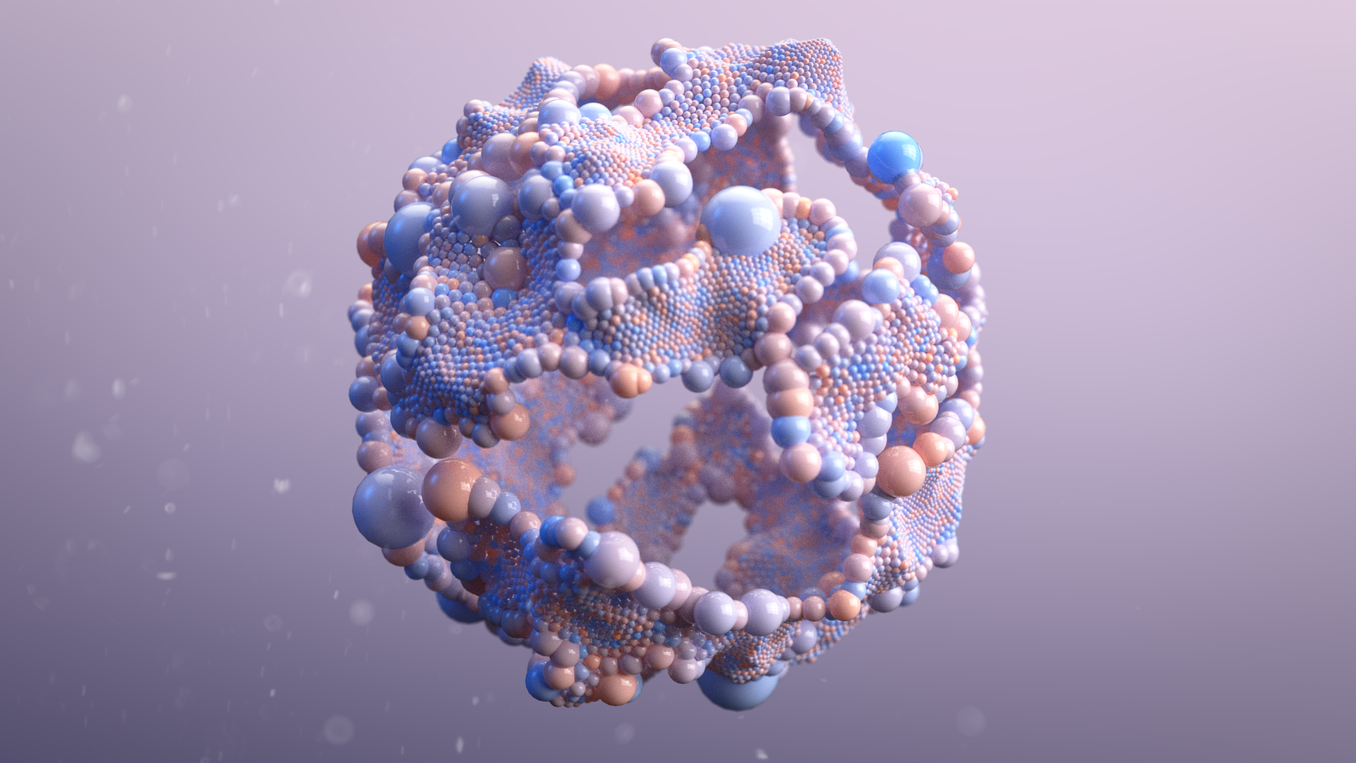
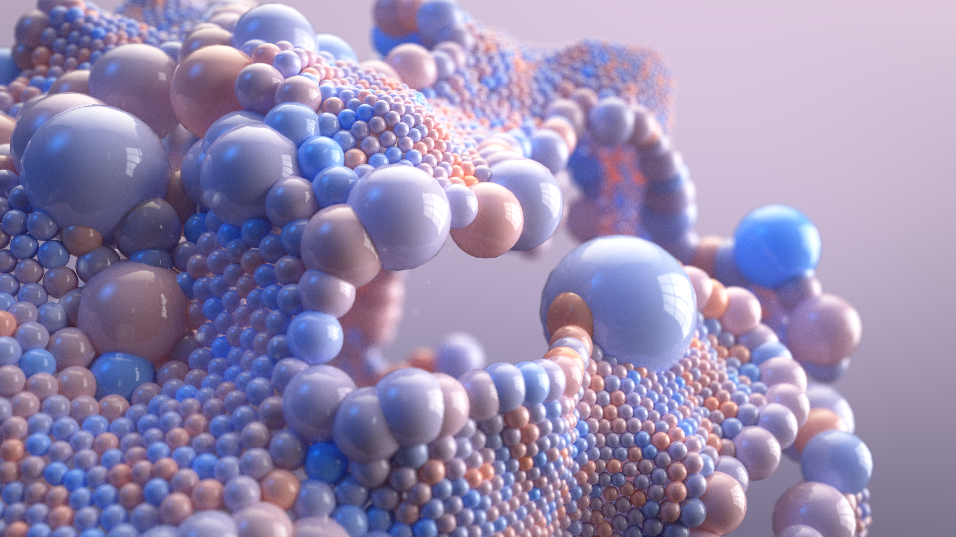
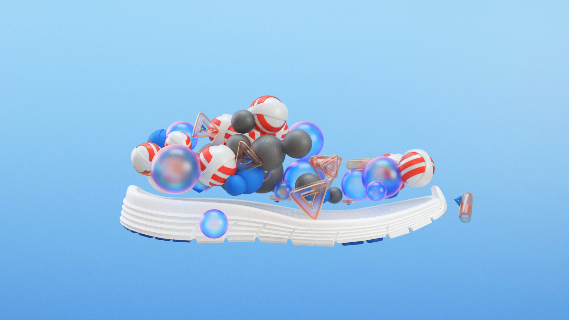
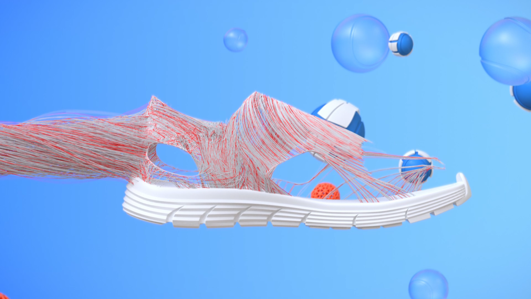
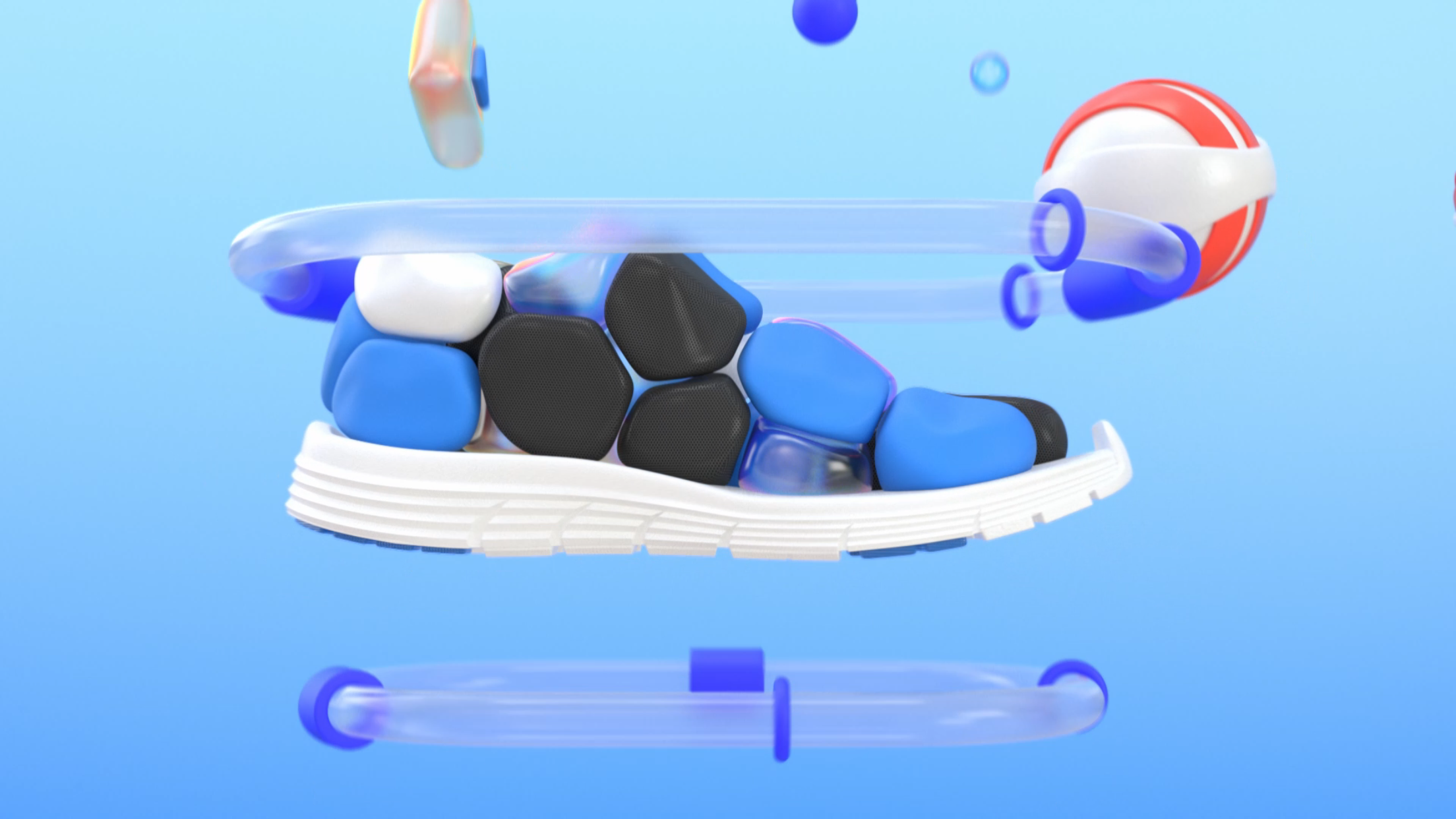
The video talked about brain growth, but our director didn't want to show a real brain, or too scientific images so he briefed Hoang Anh to use spheres and connected them in a pattern. The first approach impressed the client but all the images didn't connect to the brand very well, especially the colours.

Second Attempt

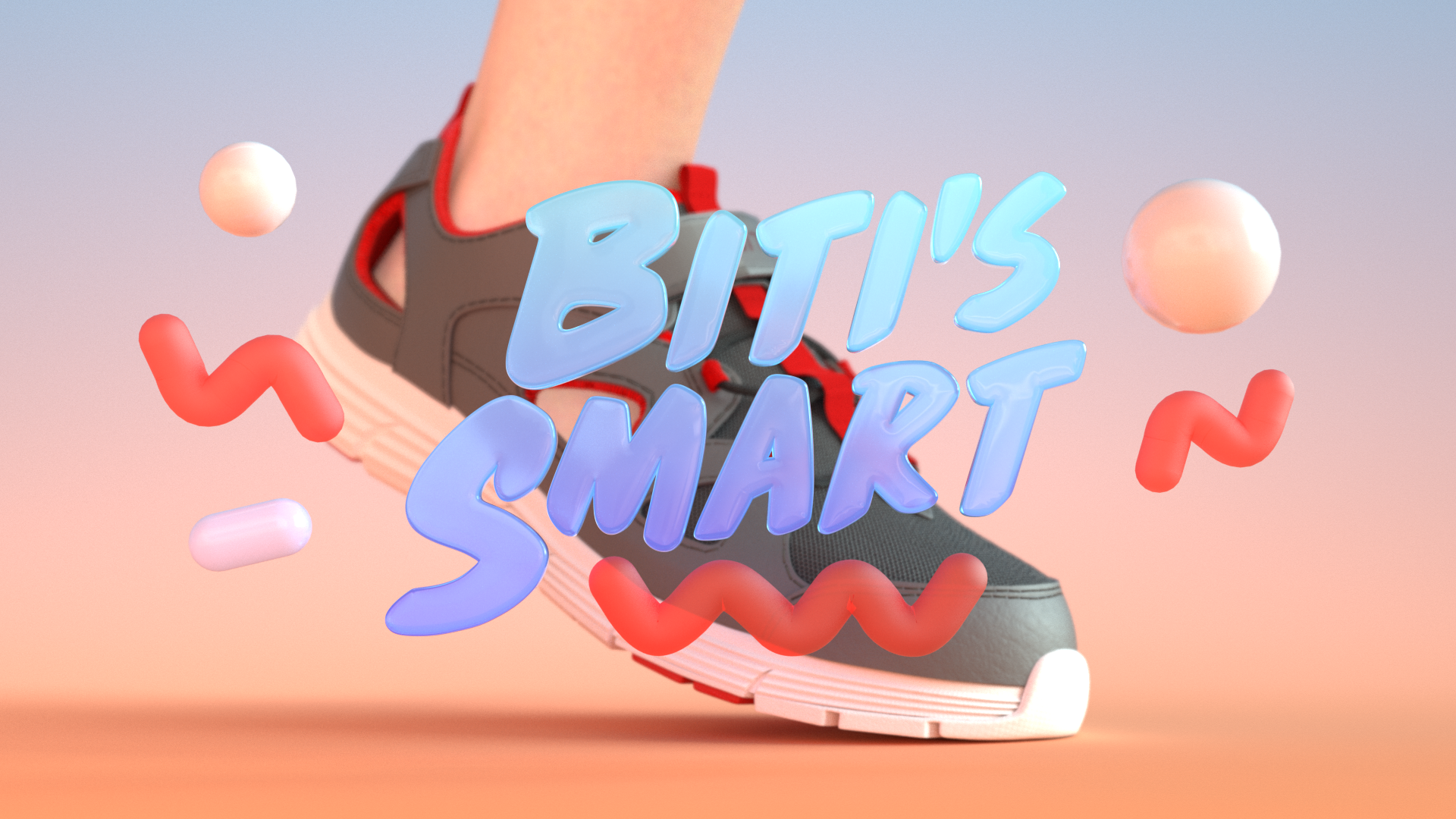
We met the client and agreed to keep the video colorful but add more red and blue to every single image. When you looked at one single image, it looked fine but they didn't connect very well as a video.

3 split screens stand for different function of the shoes.

3 split screens stood for different functions of the shoes.

Styleframe for the brain part.

Styleframe for the brain part.

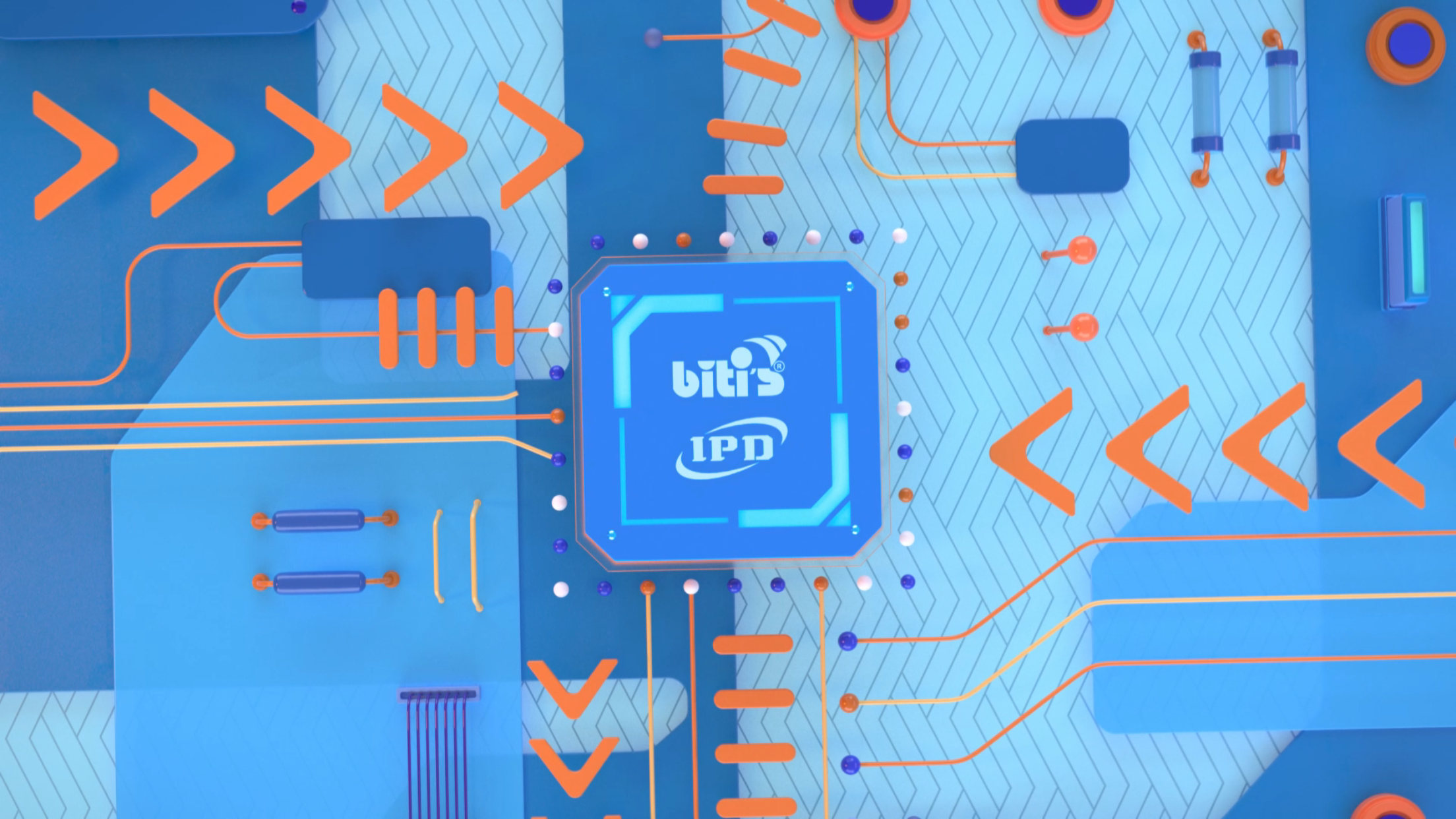
The design of the chip pattern inside the shoes.

The design of the chip pattern inside the shoes.

Third Attempt

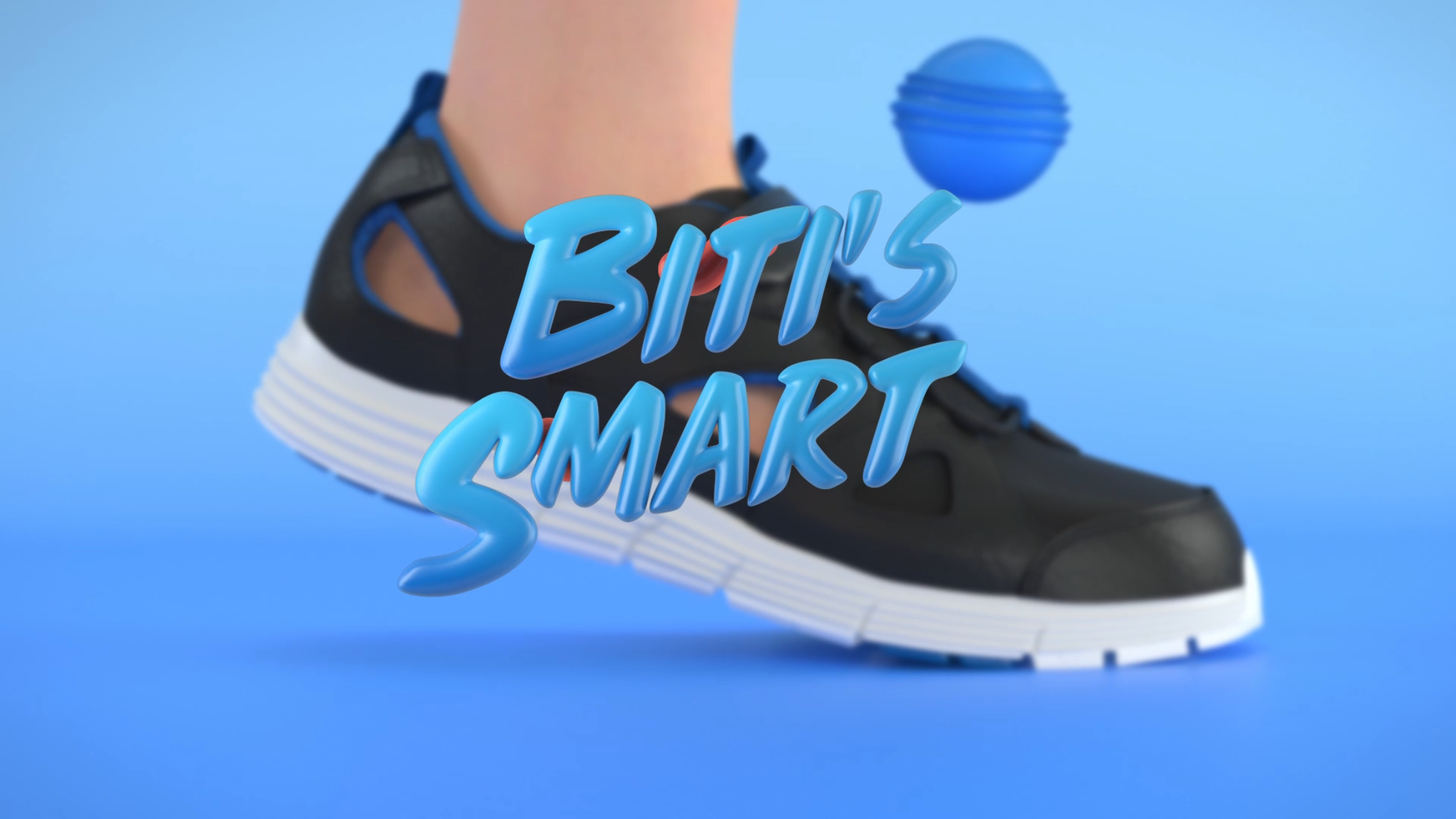
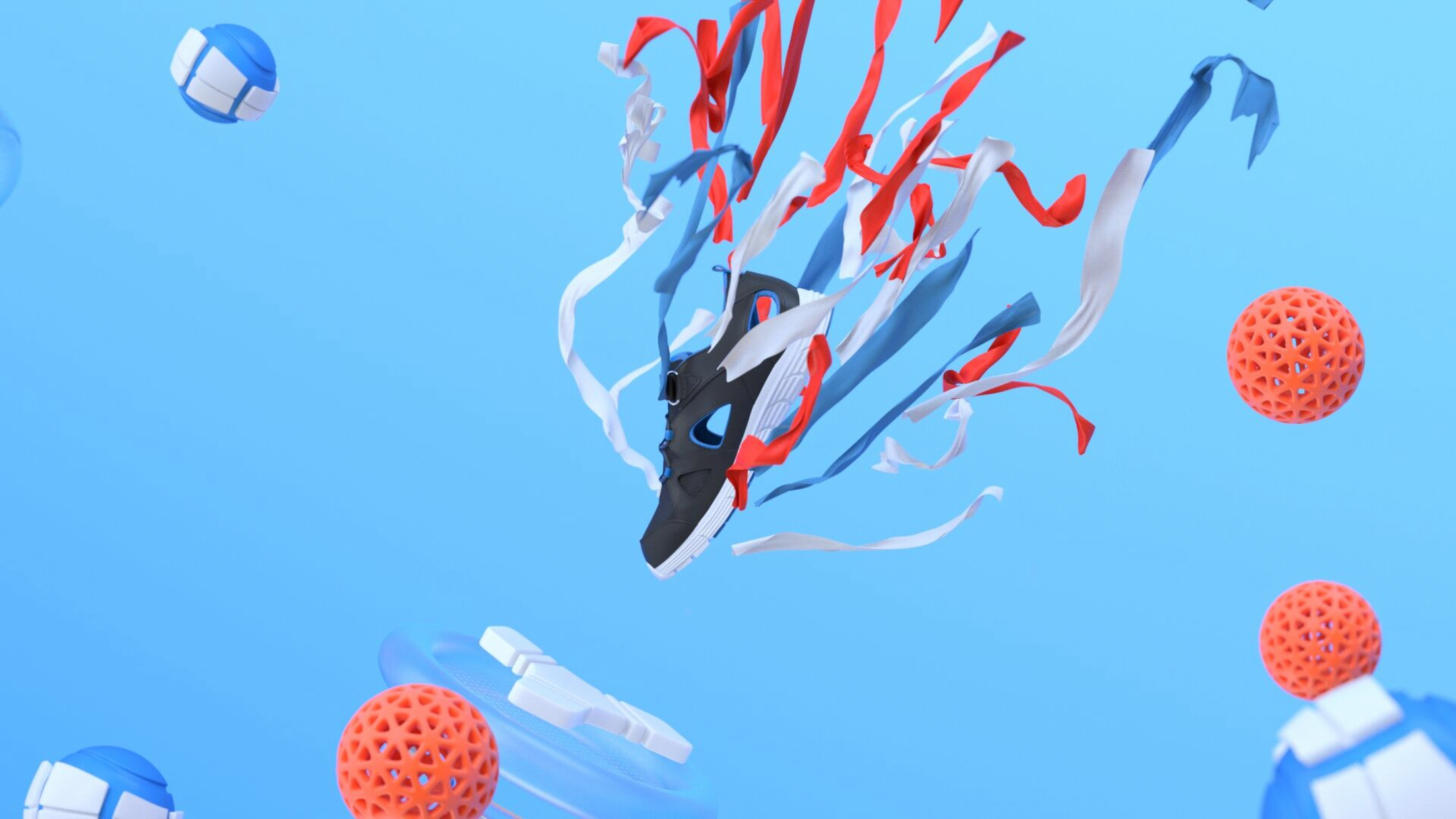
After working on many options, we discussed with the client and convinced them to use blue as the key colour and other colors like red, orange, yellow were secondary only. The final result was very pleasing. It worked very well with the brand and connected everything seamlessly.

HUD Design

We featured HUD in the video to share an idea of parents can track their kids' activities on a mobile platform. The first design brought the hi-tech feeling but didn't fit our theme. As a result, we revised and used the second design as a reference for all the HUD designs.

Frame 27.png
HUD_2-100.jpg

First Draft

If you look at the first draft, you will see that there is a big improvement on the latest version. Finally, we did it.

Wisepass: Explainer Animation

Wisepass is a lifestyle subscription-based app that allows you to enjoy complimentary perks daily in Hong Kong, Manila, Singapore, Ho Chi Minh, Kuala Lumpur, Jakarta, Bangkok, and more. Just simply download the application, let it know your taste and it will suggest to you the best places in town each time you want to go out for dinner or enjoy your favorite drinks. 

Client: Wisepass
Agency: Red Cat Motion

Congrats Mr Lam for winning a deal at Shark Tank Vietnam.

Wisepass_Lam.jpeg

Styleframes

The client decided to go with the second approach which was more application-focus with fewer details. The style should evoke the feeling of delight, modern and high-end.

Wisepass_Styleframe_1-100.jpg
Wisepass_Styleframe_180528-01.jpg
Wisepass_Styleframe_2-100.jpg
Wisepass_Styleframe_180523-01.jpg

Our Art director was very passionate so his input was enormous until we get the right mood and tone.

Wisepass_Styleframe_180523-02.jpg
Wisepass_Styleframe_180528-03.jpg
Wisepass_Styleframe_3.jpeg

Storyboard

A storyboard is the best way to visualize your story and animation ideas.

Wisepass_Storyboard_Sketch_180607_Option2.jpg

DJI Care Refresh: Explainer Animation

DJI Care Refresh is an effective program to help you cover damages or replacements of your DJI products with a small amount of charge. Red Cat Motion got a big mission to entertain DJI's audiences with useful information about the program.

Client: DJI
Agency: Red Cat Motion

How did we make this?

e137fb58584695.5a01e5cd203dd.gif

This project was a combination of 2D animation with 3D drone as we had to show the key product turning around when flying. The 3D model was made in C4D then imported into After Effects with Element 3D.

Styleframes

The timeline was rushed and the client knew what they wanted so we locked the styleframe very quickly.

DJI_Characters.jpg

Graphics

Graphics were made in 2D. The color palette looks fun, fresh and branded. Other characters such as cat and crab were designed to bring more fun and details to the visual story.

46108658584695.5a01e5cd20b73 (1).jpg
706f0458584695.5a01e5cd207e6.jpg
847fa558584695.5a01e5cd20032.jpg

Crunchbase Marketplace: Explainer Animation

Crunchbase Marketplace Video is one of the most exciting projects that we have a chance to work with. The client was open for us to play with the theme of outer space, space ships, planets, and robots to explain how the tech platform works.

Client: Crunchbase
Agency: Video Sharks
Production: Red Cat Motion

Styleframes

To convince the client, many styleframes were made. We experimented with different settings, different styles, and different colour schemes.

Crunchbase_1-100.jpg
Crunchbase_3-100.jpg
Galaxy_1.jpg
Crunchbase_Styleframe_180222-02-02.jpg

Screencast

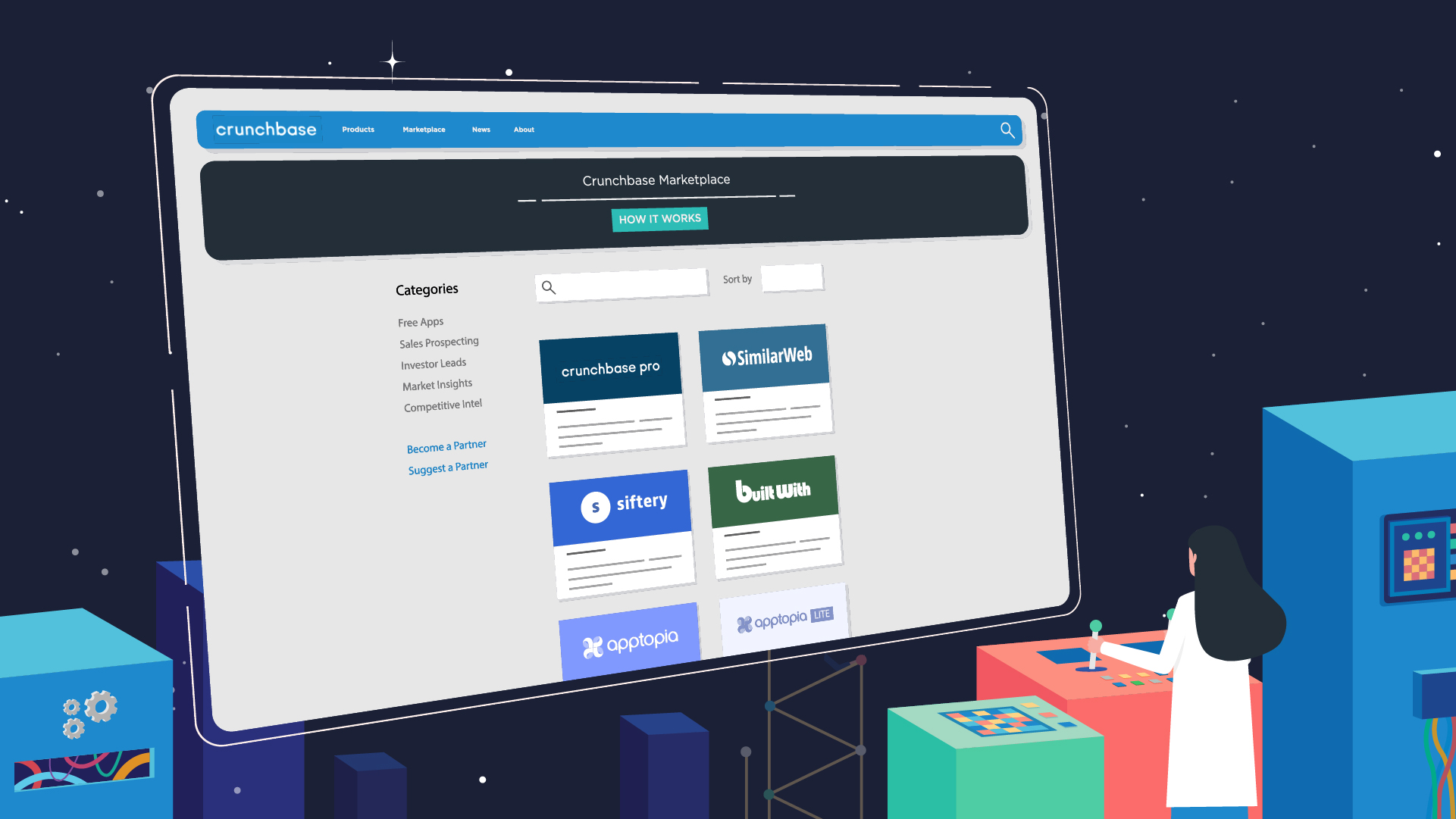
We designed some options to feature the interface of the marketplace in the video. The initial intention was to redraw the interface from a very simplified version to a more detailed interface.

Crunchbase_8-100.jpg
Crunchbase_6-100.jpg
When user chooses an app, a new card will show up on the profile page. We suggested an idea as an interpretation to showcase this feature.

When the user chooses an app, a new card will show up on the profile page. We suggested an idea as an interpretation to showcase this feature.

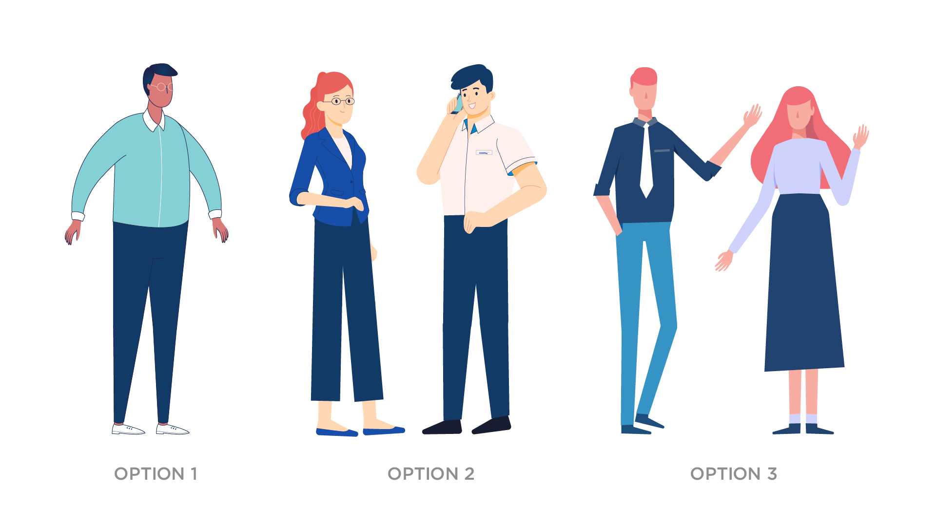
Character

We worked on many options until we get the right style that the client loved the most.

Crunchbase_Characters-100.jpg

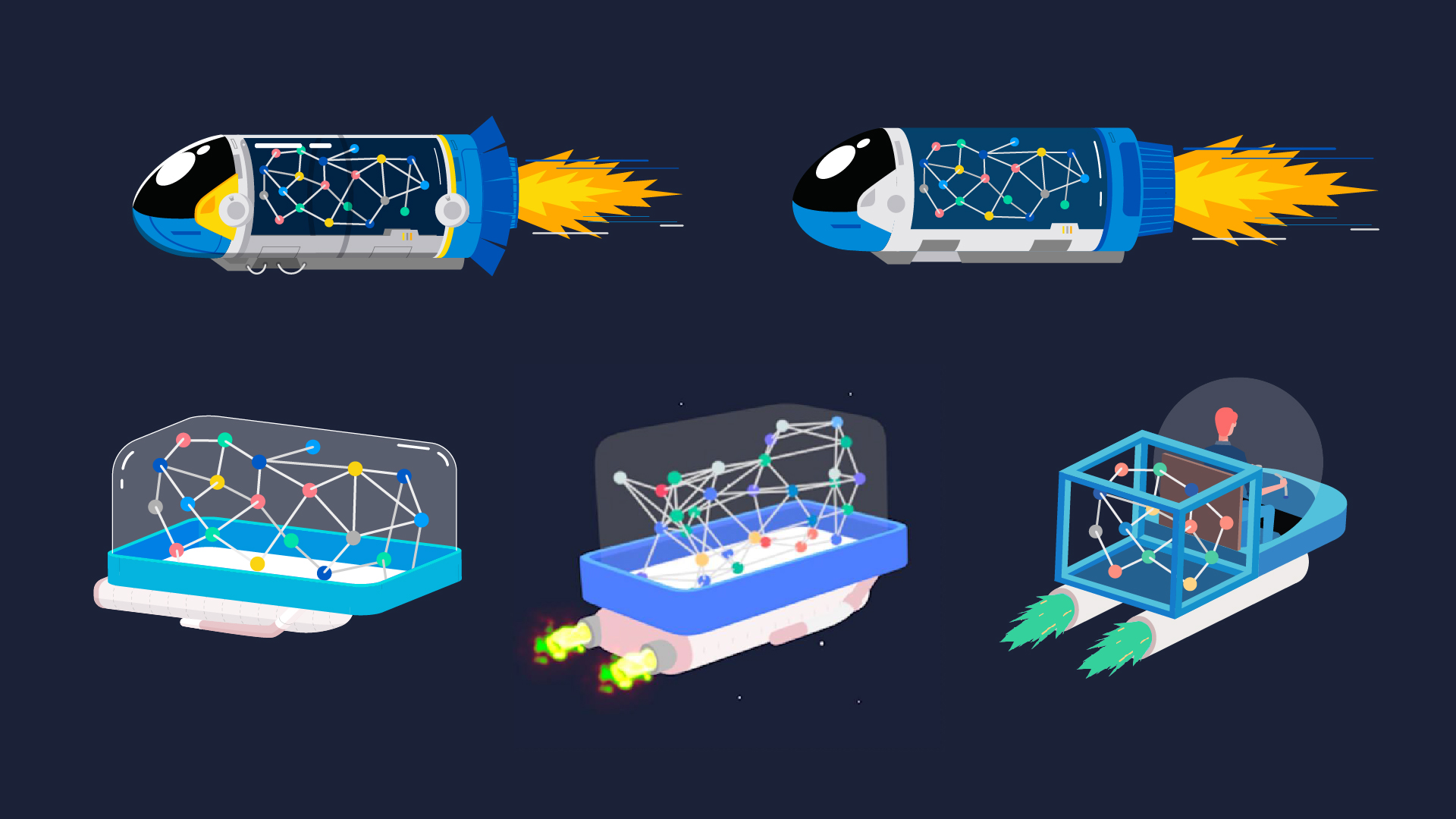
Spaceship Design

Crunchbase_5-100.jpg

Icon Design

Crunchbase_icon-100.jpg

Station Design

Crunchbase is a station where you can find all the data you wanted. We designed the Crunchbase Planet and its interior with a high level of detail.

Crunchbase_Styleframe_180222-02-02.jpg

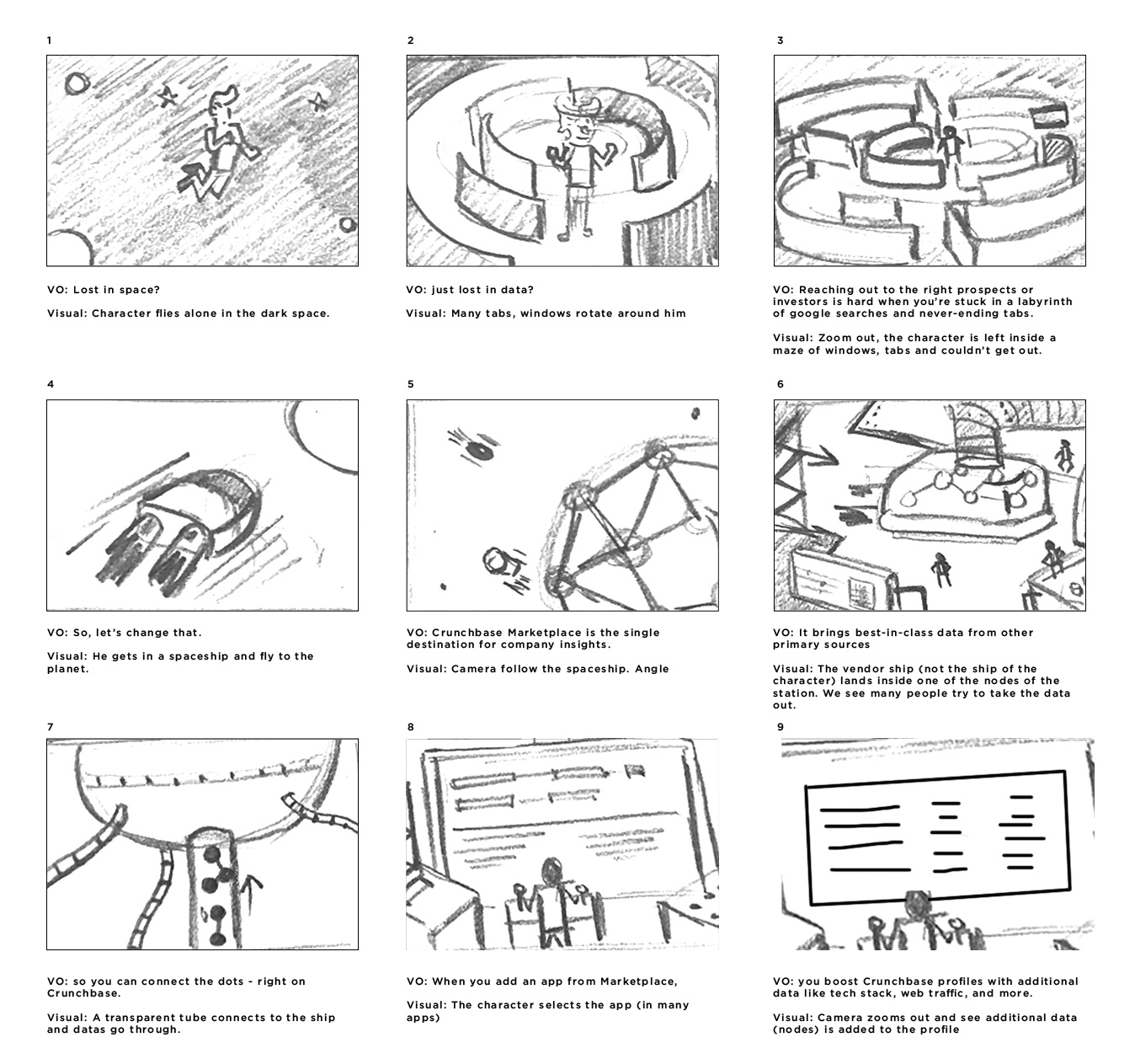
Storyboard to Graphic

The storyboard was made roughly to explain the idea before going to the full graphic.

Crunchbase_Storyboard.jpg
Crunchbase_Storyboard_2.jpg

Animation

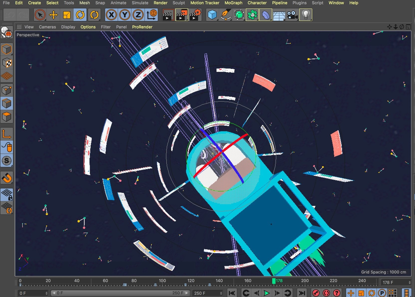
This project was a combination of different animation techniques from frame-by-frame animation to cut-out technique, and 3D animation.

Labyrinth.jpeg
Spaceship.gif

FIGS: Explainer Animation

FIGS is an online platform that helps you make better investment decision by integrating different expert-level tools and information. Red Cat creates an explainer video to explain to new audiences about FIGS.

The design style was a combination of isometric views with gradient stylized graphics. The client wanted to have cute characters in the video, so we developed characters with rounded details but not too childish.

Artboard 25-100.jpg

Chosen images with gradient color grades create a feeling of high technology.

Artboard 28-100.jpg
Artboard 25 copy-100.jpg
Artboard 30-100.jpg
Artboard 32-100.jpg
Artboard 33-100.jpg
Artboard 34-100.jpg

Priory Solutions: Explainer Animation

Priory Solutions creates different software tools that help research professionals at large organizations – especially law firms and financial institutions – better manage the Knowledge Management process. Think research professionals who help attorneys access important research from Lexus or Westlaw. It’s important to note that we’re speaking to the heads of these research teams.

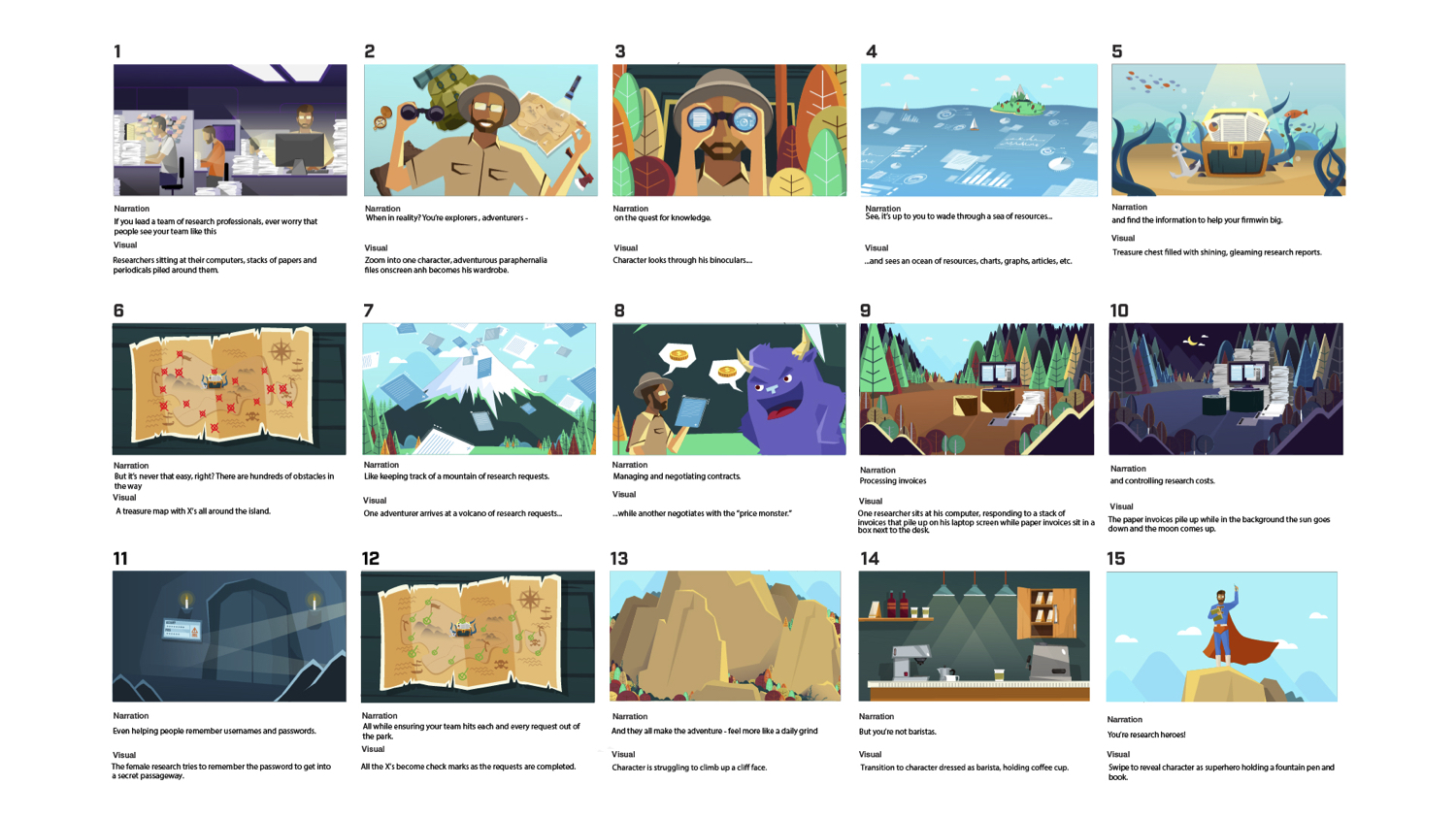
We create an animation for them with a theme of an adventurous journey. Think researchers as heroes and on the quest of exploring knowledge, they need a weapon to help them.

Based on their service, we understood that the image needs to be mature, trustworthy, not cartoony but needs to look fun and engaging as we didn't want research to become a boring term.

ShowCasePriory1.jpg

We developed 2 options of styleframe and decided the second style works best for the video.

ShowCasePriory2.jpg
ShowCasePriory3.jpg

The second styleframe elevates the story better. The researcher wears light browns adventure clothes with his high-tech binoculars on a quest to find the knowledge treasure.

ShowCasePriory4.jpg
ShowCasePriory5.jpg
ShowCasePriory6.jpg

After getting the storyboard approved, we drew all the illustrations and started animating.

ShowCasePriory7.jpg